Friday, January 31, 2014

Shelves, shelves & more shelves

How do you go about staging shelves? I wish I was a professional decorator so this post could be a step by step how to get perfect decorative shelves. But I am not. I only know a few guidelines to go by. So if you are like me and don't really know what you are doing, here are a few things to remember...
 
1.) Think about balance.
In my living room, I have two sets of built in shelves that flank my windows. They each have five shelves. Notice how on three of the shelves there is something going across the whole shelf but on the other two, the books only go across half way. When using both sides of the shelf I made sure to skip every other shelf to break it up.
 
2.) Think about color.
I painted the back of the shelves black to bring more attention to what the shelves are holding. See how the white items pop against the black back ground? I broke up all the darkness on the fourth shelf with that tin picture and white mat. I also separated the books by color to add more color blocking affects.

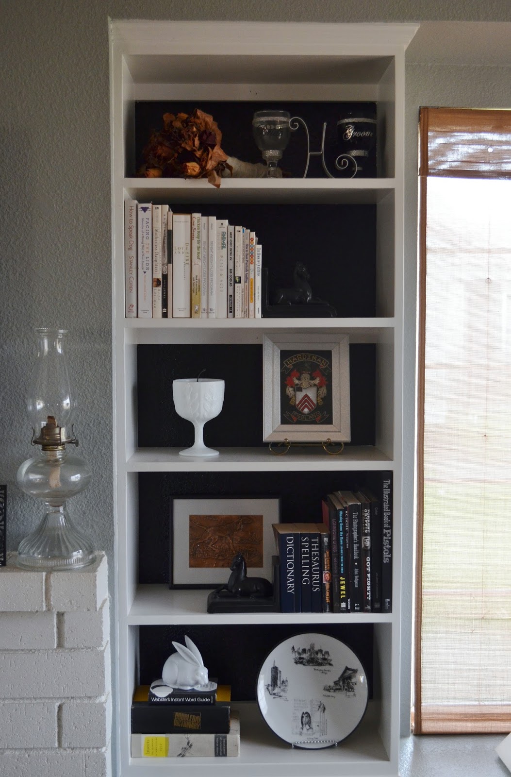
3.) Think about proportion.
This is the other side of the window. I think they built it smaller just to irritate me. Why cant they be the same size! Due to this side being smaller I made sure not to use a giant item that would take up all the back ground. I didn't want anything looking too big and squished.

 
4.) Think about height.
This is a small latter shelf that lives in my living room. I used the tall pineapple on the left and balanced that out with the tall antique doll on the right. For color, I love how the wooden doll pops against the different color books in the background. The red vintage bus unites that shelf with the one below it because of the red book.
 
 
5.) Think about pieces you LOVE.
A picture of my husbands father (who is no longer with us) sits on the top shelf, along with the monogram for our last name. Below that is a birdhouse my father built for my late grandmothers craft business. These things are very special to us. Incorporate the things you love and you cant go wrong. For color, I stacked yellow books by the yellow art.
 
 
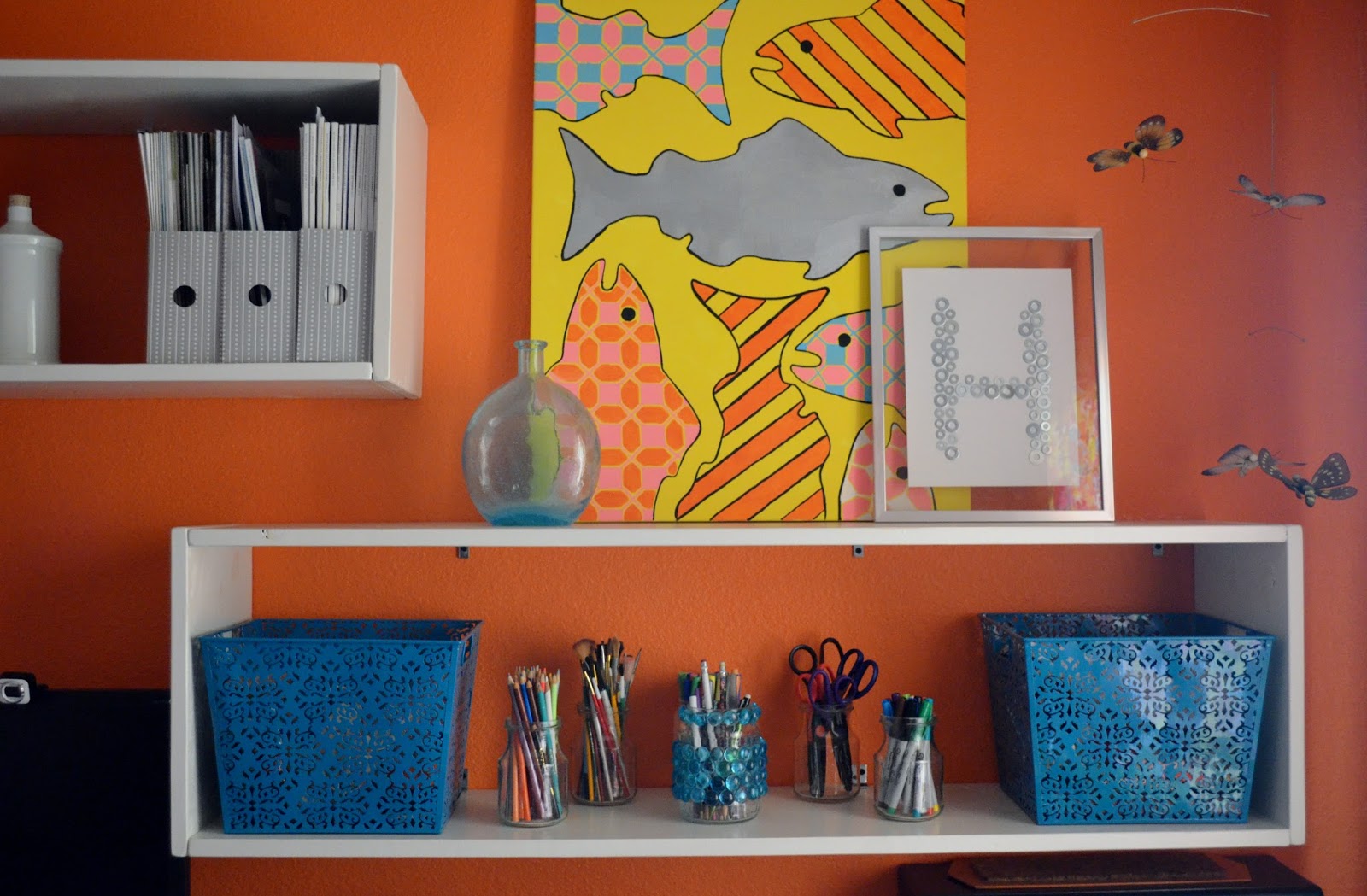
6.) Think about groups of three.
For some reason unknown to me, groups of three are more aesthetically pleasing. Notice the three jars holding my office supplies sitting on three books. Next to that I have 1 frame and 2 bottles =3 with three magazine holders next to that. You can bet that I will be adding a third globe as soon as I find one I like. Hahaha
 
 
Here we have the rule of three again with the two pieces of art and one bottle. I also kept in mind the height as I used a large canvas to fill the space and reach up to the globes height to balance them. I am not even going to talk about where I added the color! Hahaha!! I know, my office has so much color its blinding. How else will I stay awake and get work done?
 
 
On my Ikea shelves I kept height in mind by turning a painting on its side. This way it looked in proportion with the skinny long train painting. I also propped my lamp on a stack of books to make it appear taller and line up with the top of the painting. This gave it more balance.
 
 
What cool shelves have you staged lately? Do you like to redo them often? I know some people switch them up every few weeks. I'm not one for moving things around allot. It takes me a long time to put something together that I love so I'm afraid to change it. Have a fun foot ball filled weekend!
 
Stay Humble
Amber

Thursday, January 30, 2014

Lightning Picture Frames

It's almost Friday! Just a little while longer and it will be the weekend. What do you guys have planed? My weekend will be busy with a trip to Lowe's for the supplies I need to build a closet desk for a client. You can count on me posting about that project! I will also be making an Ikea run. I really wish we had one closer than San Diego. And then there is Super Bowel Sunday. I cant promise that I will watch the game but I will definitely be in front of the TV stuffing my face and chatting. Not at the same time of course.

I have finished three more frames and wanted to share them. This is the "Lightning" style frame, which is the most complicated frame to make out of the four styles. Hence the higher price.

The 4x6


The 5x7

 
The 8x10


I went a little moodier with the colors than the first set. I also went with the gold stripes sense gold is making a huge comeback lately. You can find all three in my Etsy Shop.  So what do you guys think? Any special colors or designs you would like to see? Enjoy your day!

Stay Humble
Amber

Wednesday, January 29, 2014

Scallop Picture Frames

Hi guys! Sorry I have been MIA. I have been busy working on my frames in an attempt to finally open my Etsy Shop. Kind of silly to have a Facebook/Blog about Frame Candy when I have no frames finished. So that is changing. I wanted to share three frames that I finished yesterday. I have been working on them a while (as in days) I was having a hard time finding a protecting glaze that I liked. But Michael's came to my rescue when Lowe's and Home Depot let me down. So here they are...

The yellow 4x6


The blue 5x7 
 

 The white 8x10
 
All three can be purchased in my Etsy Shop. Don't forget, I also take custom orders. Have a wonderful day! I'm off to finish the other six frames I'm working on.

Stay Humble
Amber

Friday, January 24, 2014

Make the Art you want

Have you ever been on a art search for a special piece, to go in a particular spot in your home only to never find it? I have. There have been times that I searched for months. I got sick of looking and decided to take matters into my own hands. Literally!

There are five rooms in my house that I have made art for. I am hear to tell you that you don't need to be an artist to do it. If you have something in mind or see something that inspires you- make it! If you flunked art class then make something abstract. It will look like you did it all on purpose. Haha! There are no rules to creating art. That's what makes it so wonderful!

I made this for my guest/nieces bedroom. If you know how to use scissors then you can make this. I cut the pieces out of printed scrap book paper and Mod Podged it onto a canvas that I had painted white. It was that simple.

 
These guys live in my dinning room. One is a black and white painting on canvas of some shapes and the other is string art. (I was inspired by Jesse at Nine Red. He makes the most amazing string art. His Etsy shop is worth looking at!)


This is my version of  Natasha Wescoat- June Tree. I loved this tapestry but didn't have $209.99 for it. So I tried to recreate it with the colors I have in my bedroom. It doesn't even come close to her amazing skill but it works for the room.


This fish art is in my office. I painted it when I found the wooden fish (in yesterdays post) at a thrift store. I used it to make the stencil and then painted away.

 
Last is the large painting I did in my living room. It is a large wall that needed something big. I found a large printed canvas at Ross on clearance. It wasn't a print I liked but the size was amazing for the price. So I took it home and primed over the print to create a blank canvas. I have allot of black, white and greys in this room so I wanted to bring in color. I made this stencil (which you have already seen on the side table I'm selling.) I added some rainbow stripes and called it a day. (Sorry for the horrible photo. I was in a hurry and had to use one from my phone.)
 
 
Maybe this weekend you can make some art for your house? I would love to see it! Even if you are not an artist it will be a special piece that no body else has in the world. That alone makes it a priceless treasure. Have a art filled weekend!
 
Stay Humble
Amber

Thursday, January 23, 2014

Knock Knock a new door

A newly painted door is a great way to update your home. It makes such a statement and its cheep and easy to do. Every time I walked through this door it made me want to fall asleep. So boring! It wasn't doing anything for our house either.


It was difficult to pick the color. My house is light yellow with white trim. What goes with yellow? I didn't want the same red door you see all over the place.(Don't get me wrong, I still love a red door!) I thought about different blues but I just wasn't feeling them. Everything I thought of just seemed so blah. Then I thought about how we would like to paint the house in the future. What direction we would like to go with it. That lead me to black. Yes, I said black. I thought it would be the perfect contrast this house needed to make more of a statement. Lets face it, pale yellow doesn't scream "look at me" so black came to the rescue!

It took me one day to put two coats of oil based primer and three coats of black paint on the door. (I wanted to make sure it was ready for high traffic) I applied most of it with a small foam roller and used a paint brush for the groves and around the window. Using the foam roller is very important if you want to avoid brush strokes which lead to an ugly door.


Much better! I tied in more black with a bench to hold the plants I haven't killed yet. A black wind chime, a black and white monogram H flag and some black and white house numbers I made. (Sorry, you don't get to see those)


 I also made this door wreath to spice it up a little.


So there she is. Its a nice balance for me and the house. Me being more eclectic and the house being on the traditional side. The next thing on the list is to replace the lights (1 by the door & the 2 on the garage)


 Are you guys trying to find the courage to paint your door a fun color? I say go for it! Its just paint. It can always be repainted if you hate it. Have a great day!

Stay Humble
Amber
01